Uh oh!
There was an error while loading. Please reload this page.
[4.x] More UI Improvements - #7589
Merged
Merged
Conversation
Merged
* Redesign the Entry Listing UI/UX
Now with better use of space, more intuitive UX, and responsive friendly
* Ensure query changes to a filter will refresh the view properly
* Wire up Terms Listing
* Wire up Users Listing (filters not working on the PHP side yet)
* Don't need this check for allowColumnPicker here
* Adjust bulk actions height
* Make role queryable like user groups currently are.
* Fix user role and group filter class queries (stache only atm).
* Allow fields to be filtered on users listing.
* Pass tests again.
* Responsive improvements
* Autofocus search when showing filters
* nextTick to the rescue
* Bind `f` to show filters (which autofocuses search).
* Fix errors on listings that don’t have search filter (ie. collections listing).
* Remove `$pinned` property from filters in php.
* Remove `$pinned` property from new filter stub.
* Remove pinned filter concept from Filters component.
---------
Co-authored-by: Jesse Leite <jesseleite@gmail.com>
* Make Status its own column
Co-Authored-By: Jason Varga <jason@pixelfear.com>
* Greatly improve the data-tables UI in every way
- titles will wrap to 2 lines max, will show the status dot if there's no status field shown
- relationship fields have a new little badge style and will truncate to each on one line
- content fields get smaller text and wrap to 2 lines max
- new status column
- title fields have a reasonable min-width set because they're important
- title fields will still show the status dot if the status column isn't visible
- date fields will no longer wrap to two lines
- wide tables will scroll horizontally instead of overflow, keeping the checkbox and actions columns in view at all times
* Refresh the ColumnPicker UI
* Apply fixes from StyleCI
---------
Co-authored-by: Jason Varga <jason@pixelfear.com>
Co-authored-by: StyleCI Bot <bot@styleci.io>
This was referenced Mar 9, 2023
…ore-ui-improvements
Sticky toolbars were pretty problematic in lots of edge cases. I feel like it's better to just stick to full screening or using the floating toolbar for editing lots of text and not relying on the sticky toolbar.
jackmcdade
commented
Mar 13, 2023
MemberAuthor
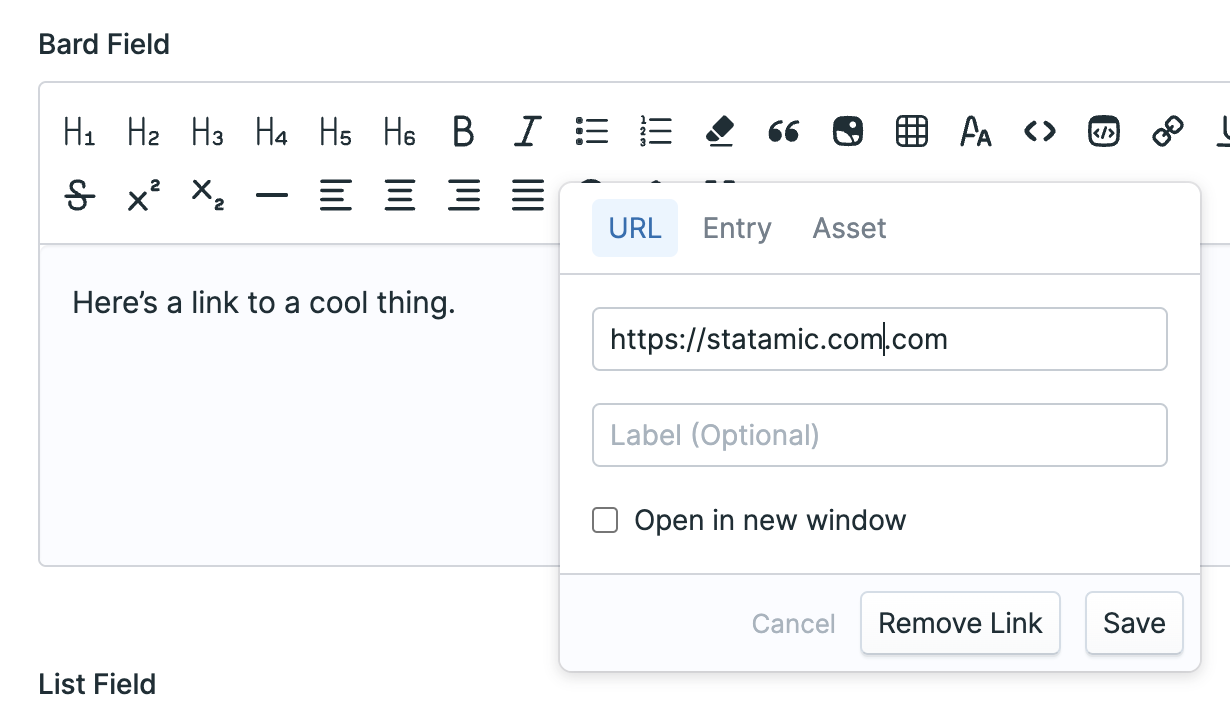
Screenshot of updated Bard Link popover.
|
# Please enter a commit message to explain why this merge is necessary,
# especially if it merges an updated upstream into a topic branch.
#
# Lines starting with '#' will be ignored, and an empty message aborts
# the commit.
This was referenced Mar 13, 2023
This file contains hidden or bidirectional Unicode text that may be interpreted or compiled differently than what appears below. To review, open the file in an editor that reveals hidden Unicode characters.
Learn more about bidirectional Unicode characters
Sign up for freeto join this conversation on GitHub.
Already have an account?
Sign in to comment
3 participants
Add this suggestion to a batch that can be applied as a single commit.This suggestion is invalid because no changes were made to the code.Suggestions cannot be applied while the pull request is closed.Suggestions cannot be applied while viewing a subset of changes.Only one suggestion per line can be applied in a batch.Add this suggestion to a batch that can be applied as a single commit.Applying suggestions on deleted lines is not supported.You must change the existing code in this line in order to create a valid suggestion.Outdated suggestions cannot be applied.This suggestion has been applied or marked resolved.Suggestions cannot be applied from pending reviews.Suggestions cannot be applied on multi-line comments.Suggestions cannot be applied while the pull request is queued to merge.Suggestion cannot be applied right now. Please check back later.
Left to do:
@container. Should switch it to a Popover withstrategy="fixed"..btn-smto match Listing header buttons