Material Intro View is a showcase android library.
We saw this kind of showcase on Fabulous App and we love it. Then decided to create showcase just like it.
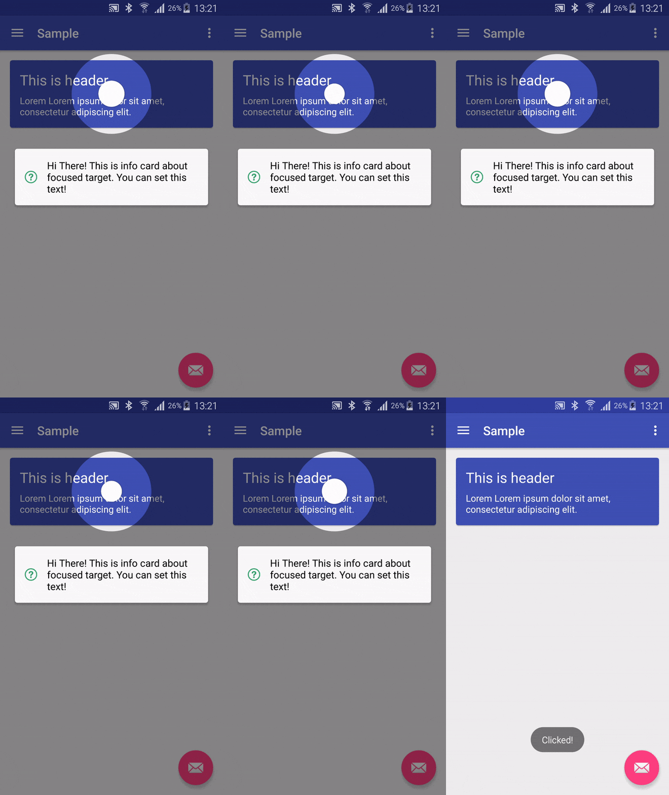
#Screen
#Usage
newMaterialIntroView.Builder(this)
.enableDotAnimation(true)
.enableIcon(false)
.setFocusGravity(FocusGravity.CENTER)
.setFocusType(Focus.MINIMUM)
.setDelayMillis(500)
.enableFadeAnimation(true)
.performClick(true)
.setInfoText("Hi There! Click this card and see what happens.")
.setShapeType(ShapeType.CIRCLE)
.setTarget(view)
.setUsageId("intro_card") //THIS SHOULD BE UNIQUE ID
.show();Project build.gradle
repositories {
maven {
url"https://jitpack.io"
}
}
Module build.gradle
dependencies {
compile'com.github.iammert:MaterialIntroView:1.6.0'
}.setMaskColor(Color.Blue) .setDelayMillis(3000) //starts after 3 seconds passed.enableFadeAnimation(true) //View will appear/disappear with fade in/out animation//ie. If your button's width has MATCH_PARENT.//Focus.ALL is not a good option. You can use//Focus.MINIMUM or Focus.NORMAL. See demos below.
.setFocusType(Focus.MINIMUM)
.setFocusType(Focus.NORMAL)
.setFocusType(Focus.ALL)//ie. You can focus on left of RecyclerView list item.
.setFocusGravity(FocusGravity.LEFT)
.setFocusType(FocusGravity.CENTER)
.setFocusType(FocusGravity.RIGHT).setTarget(myButton) //Focus on myButton.setTargetPadding(30) //add 30px padding to focus circle.setInfoText("This is info text!") //Setting text will enable info dialog.setTextColor(Color.Black) //Info dialog's text color is set to black.setInfoTextSize(30) //Change text size.setShapeType(ShapeType.CIRCLE) //Change shape of focus area
.setShapeType(ShapeType.RECTANGLE) //Change shape of focus area.setCustomShape(Shapeshape) //Use custom shape// Allow this showcase overlay to only show up once. Prevents multiple screens from showing at the same time.// Useful if you wish to show a tour step in a code that gets called multiple times
.setIdempotent(true).setUsageId("intro_fab_button") //Store intro view status whether it is learnt or not.enableDotAnimation(true) //Shows dot animation center of focus area.enableIcon(false) //Turn off helper icon, default is true.performClick(true) //Trigger click operation when user click focused area.//If you don't want to perform click automatically//You can disable perform clik and handle it yourself
.setListener(newMaterialIntroListener() {
@OverridepublicvoidonUserClicked(StringmaterialIntroViewId) {
}
})
//Create global config instance to not write same config to builder//again and again.MaterialIntroConfigurationconfig = newMaterialIntroConfiguration();
config.setDelayMillis(1000);
config.setFadeAnimationEnabled(true);
...
.setConfiguration(config) //You can use your own highlight shapes if Circle and Rectangle do not work for you. See source for Circle and Rect for implementation example.
publicclassMyShapeextendsShape {
// ... your implementation
}
//... in your app code
.setCustomShape(MyShapeshape)


- Sample app will be more detailed about using library.
- Sequence for MaterialIntroViews
#Authors
#Docs Chinese Doc
Copyright 2015 Mert Şimşek.
Licensed under the Apache License, Version 2.0 (the "License");
you may not use this file except in compliance with the License.
You may obtain a copy of the License at
http://www.apache.org/licenses/LICENSE-2.0
Unless required by applicable law or agreed to in writing, software
distributed under the License is distributed on an "AS IS" BASIS,
WITHOUT WARRANTIES OR CONDITIONS OF ANY KIND, either express or implied.
See the License for the specific language governing permissions and
limitations under the License.