


Add this to your package's pubspec.yaml file:
dependencies:
flutter_button: ^0.0.4
and command pub get in termianal
$ flutter pub get
and time to import package.
import'package:flutter_button/flutter_button.dart';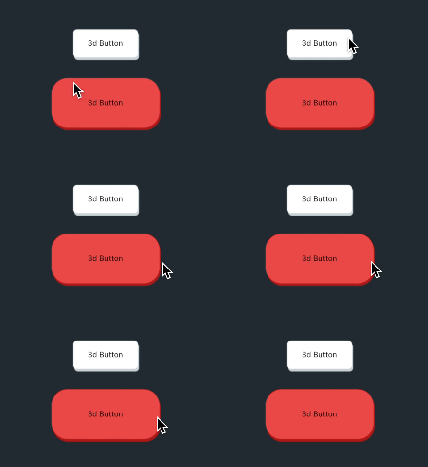
Button3D(
onPressed: () {},
child:Text("3d Button"),
),
Button3D(
style:StyleOf3dButton(
backColor:Colors.red[900],
topColor:Colors.red[400],
borderRadius:BorderRadius.circular(30),
),
height:100,
width:200,
onPressed: () {},
child:Text("3d Button"),
),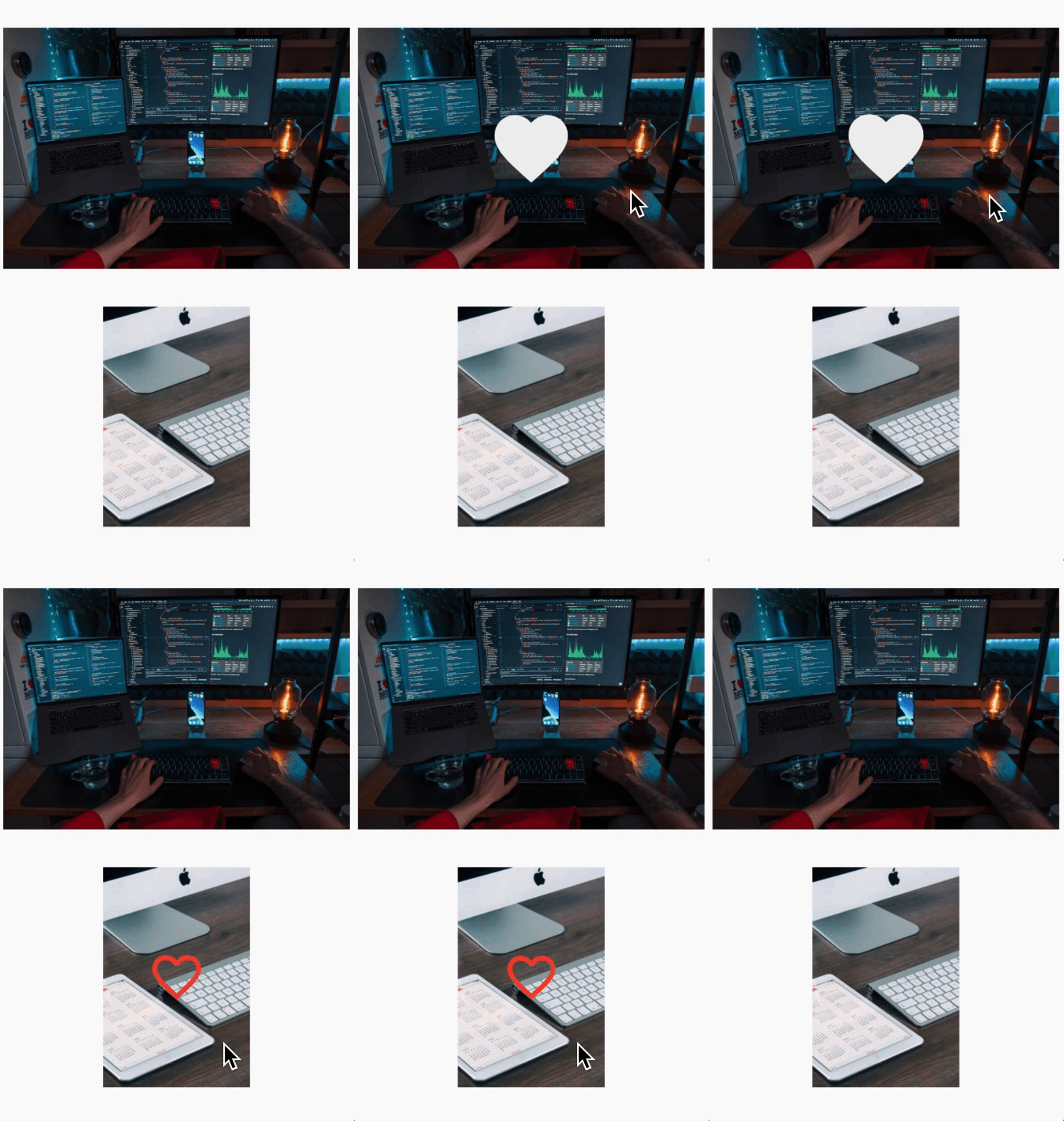
InstaLoveButton(
image:AssetImage("assets/photo.png"),
onTap: () {},
),
InstaLoveButton(
iconColor:Colors.red,
icon:Icons.favorite_border,
size:80,
height:250,
//width: MediaQuery.of(context).size.width,
curve:Curves.bounceInOut,
duration:Duration(seconds:1),
image:NetworkImage("https://picsum.photos/200/300"),
onTap: () {},
),
StoryButton(
size:80,
onPressed: () {},
child:Image.asset(
'assets/avatar.JPG',
height:70,
),
strokeWidth:3.5,
radius:100,
gradient:LinearGradient(
begin:Alignment.topRight,
end:Alignment.bottomLeft,
colors: [
Colors.pink,
Colors.orange,
],
),
),
SizedBox(width:30),
AnimatedStoryButton(
onTap: (){},
storyButton:StoryButton(
size:100,
onPressed: () {},
child:Image.network(
'https://avatars1.githubusercontent.com/u/59066341?s=400&v=4',
height:80,
),
strokeWidth:5,
radius:100,
gradient:LinearGradient(
colors: [
Colors.blue,
Colors.red,
Colors.green,
],
),
),
),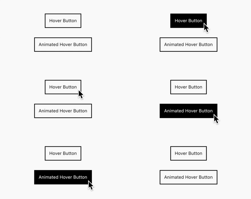
HoverButton(
title:"Hover Button",
onTap: () {},
),
AnimatedHoverButton(
title:"Animated Hover Button",
onTap: () {},
),
Note: You can override so customise button with this parameters: titleSize, titleColor, spashColor, tappedTitleColor, fontWeight, borderColor, borderRadius.

//Default modeLikeButton(
onTap: () {},
),
SizedBox(height:30),
// Like Button with fully optionsLikeButton(
icon:Icons.home,
deactiveColor:Colors.grey,
activeColor:Colors.purple,
deactiveSize:50,
activeSize:55,
curve:Curves.easeInExpo,
onTap: () {},
),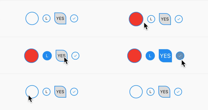
AnimatedCheckBox(
activeSize:55,
defaultSize:50,
activeColor:Colors.red,
onChanged: () {
value =!value;
},
),
//AnimatedTitleCheckBox(
title:"L",
onChanged: () {
value1 =!value1;
print("AnimatedTitleCheckBox's value = $value1");
},
),
//AnimatedTitleCheckBox(
inactiveColor:Colors.grey[300],
activeSize:50,
defaultSize:45,
activeTitleSize:22,
defaultTitleSize:16,
title:"YES",
onChanged: () {
value2 =!value2;
print("Customized AnimatedTitleCheckBox's value = $value2");
},
borderRadius:BorderRadius.only(
bottomLeft:Radius.circular(20),
topRight:Radius.circular(20),
),
),
//AnimatedIconCheckBox(
icon:Icons.done,
onChanged: () {
value3 =!value3;
print("AnimatedIconCheckBox's value = $value3");
},
),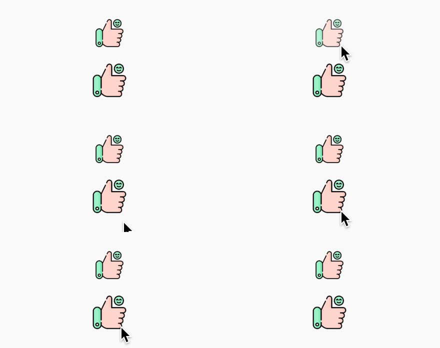
OpacityButton(
onTap: () {},
opacityValue: .3,
child:Image.asset(
'assets/like.png',
height:60,
),
),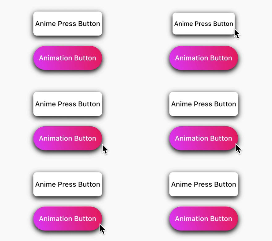
AnimePressButton(
onTap: () {},
title:"Anime Press Button",
),
AnimePressButton(
borderRadius:BorderRadius.circular(100),
color:Colors.red,
onTap: () {},
wGradient:true,
gradientColors: [
Colors.pink,
Colors.purpleAccent,
],
title:"Animation Button",
titleColor:Colors.white,
),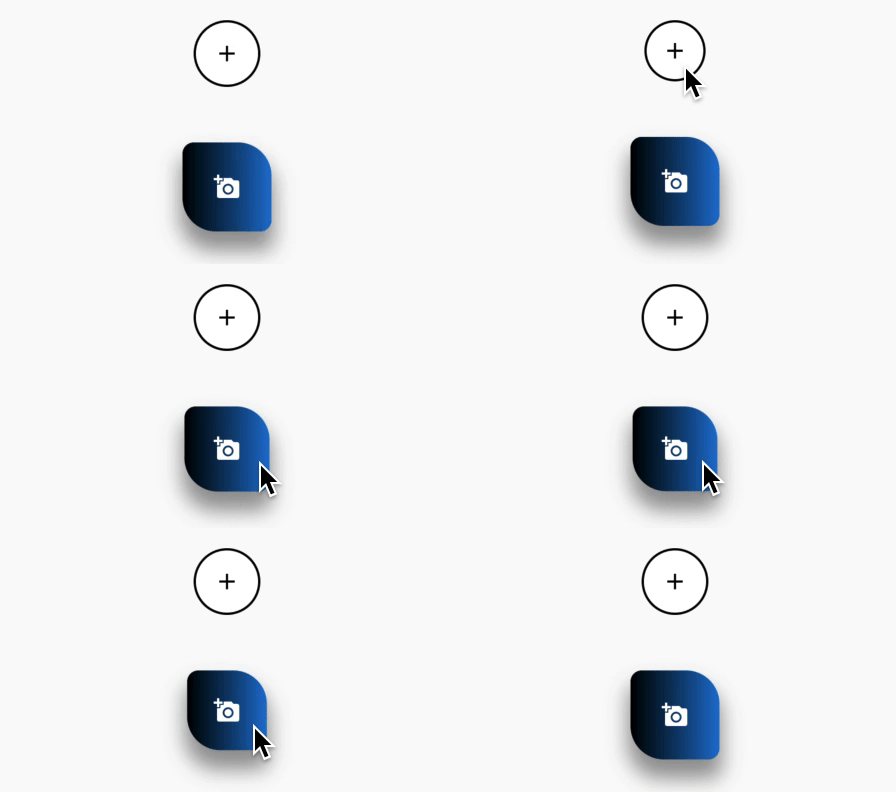
AnimatedCustomFAB(
child:Icon(Icons.add, color:Colors.black),
onTap: () {},
backgroundColor:Colors.white,
border:Border.all(color:Colors.black, width:2),
),
Note: You can also override so customise button with this parameters: size, tappedSize, duration, wGradient, wShadow, shadows, gradientColors, borderRadius.
if wGradient property is true than backgroundColor: property won't work.
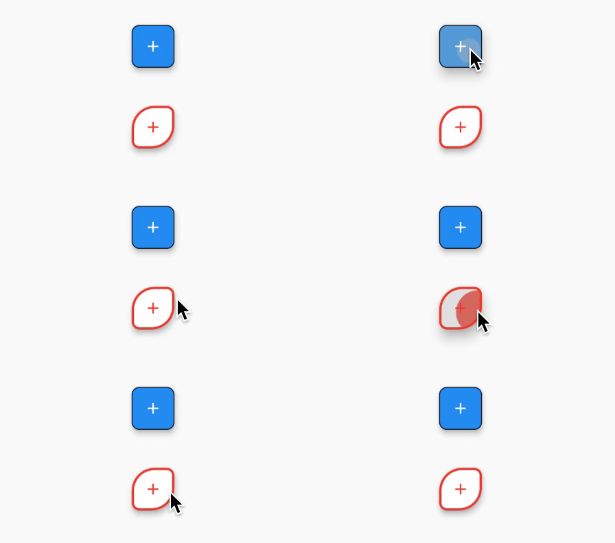
CustomFAB(
child:Icon(Icons.add),
onTap: () {},
border:BorderSide(color:Colors.black),
),
Note: You can also override so customise button with this parameters: backgroundColor, splashColor, hoverColor, topLeftRadius, bottomRightRadius, topRightRadius, bottomLeftRadius.
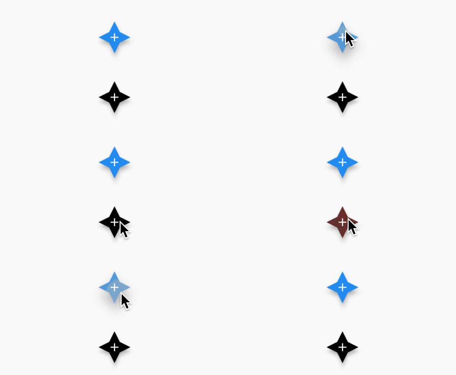
StarFAB(
child:Icon(Icons.add),
onTap: () {},
),
/// All properties was usedStarFAB(
backgroundColor:Colors.black,
child:Icon(Icons.add),
splashColor:Colors.red,
elevation:5,
onTap: () {},
),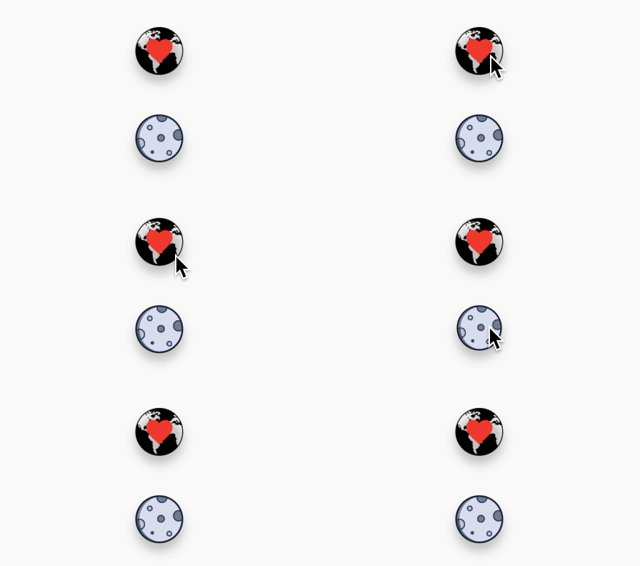
ImageFAB(
image:AssetImage("assets/earth.png"),
child:Icon(Icons.favorite, color:Colors.red, size:40),
onTap: () {},
wOpacity:true,
opacityValue: .3,
),
Note: You can also override so customise button with this parameters: borderRadius, border, shadows, onImageError, imageColorFilter, imageFit, imageAlignment, imageCenterSlice, imageRepeat, imageMatchTextDirection, imageScale.
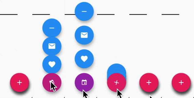
MenuFAB(
curve:Curves.bounceInOut,
animatedIcon:AnimatedIcons.add_event,
activeColor:Colors.purple,
inactiveColor:Colors.pink,
firstItem:FloatingActionButton(
onPressed: () {},
child:Icon(Icons.favorite),
),
seccondItem:FloatingActionButton(
onPressed: () {},
child:Icon(Icons.mail),
),
thirdItem:FloatingActionButton(
onPressed: () {},
child:Icon(Icons.remove),
),
),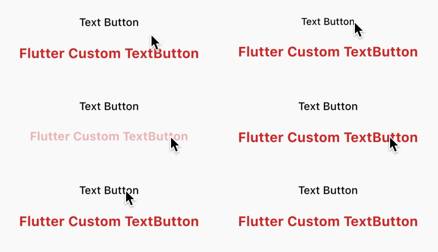
FlutterTextButton(
title:"Text Button",
onTap: () {},
),
// Full options used version of TextButtonFlutterTextButton(
onTap: () {},
wOpacity:true,
opacityValue: .3,
title:"Flutter Custom TextButton",
defaultSize:25,
textAlign:TextAlign.center,
pressedSize:22,
color:Colors.red[700],
fontWeight:FontWeight.bold,
/// [locale:] Whathever you wanna /// [fontFamily:] type your fontFamily),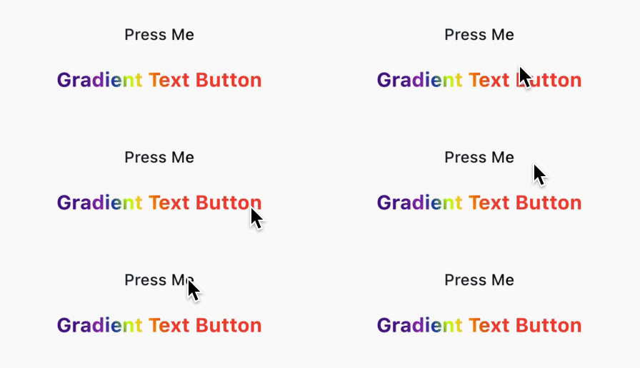
GradientTextButton(
title:"Press Me",
onTap: () {},
),
/// Full options used version of TextButtonGradientTextButton(
onTap: () {},
title:"Gradient Text Button",
wOpacity:true,
opacityValue: .3,
gradientColors: [...],
beginGradient:Alignment.topCenter,
/// [endGradient: ...] also you can add this endGradient function defaultSize:25,
textAlign:TextAlign.center,
pressedSize:22,
fontWeight:FontWeight.bold,
/// [locale:] Whathever you wanna/// [fontFamily:] type your fontFamily),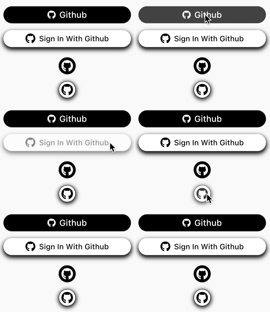
GithubAuthButton(
borderRadius:BorderRadius.circular(30),
wOpacity:true,
onTap: () {},
),
CircularGIAuthButton(
borderRadius:BorderRadius.circular(30),
onTap: () {},
wOpacity:true,
),
GithubAuthButton can change with FacebookAuthButton, GoogleAuthButton and TwitterAuthButton.
And can take this parameters: title, backgroundColor, titleColor, iconColor, shadows, fontSize, iconSize, fontWeight, wGradientColors, opacityValue, gradientColors, beginGradient, endGradient.
CircularGIAuthButton can change with CircularFBAuthButton, CircularGGAuthButton and CircularTWAuthButton.
And can take this parameters: backgorundColor, iconColor, wBorder, borderColor, opacityValue, size, iconSize, shadows, `borderRadius.
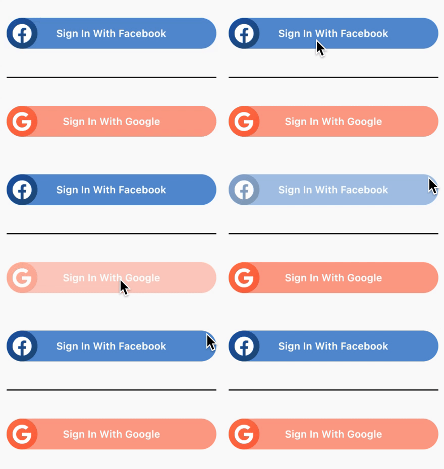
MagicalFBButton(
title:"Sign In With Facebook",
opacityValue: .5,
onTap: () {},
),
MagicalGGButton(
title:"Sign In With Google",
opacityValue: .5,
onTap: () {},
),
Note: U can change only MagicalFBButton with GG, TW or GI for get Magical Google, Twitter and Github buttons,
Magial Buttons:MagicalFBButton, MagicalGGButton, MagicalGIButton, MagicalTWButton.
if you wanna to know more about using this plugin check example repository.
in there every button was used and explained everthing flutter_button