Repository files navigation

###The React-Native-Buttons Build StatusCoverage Status

react native button based on pure JavaScript with good expansibility.

Main

  • This component provide 5 theme color for user to chose.
  • This component provide 2 type of button for user to chose.
  • This component provide the function that user can define their own theme color, we can help them to calculate the disabled color, active color and so on. Also they can define the disabled color and active color by themselves if they like.
  • This component provide the ripple effect of the button. And due to lower Android API which do not have this effect, we use highlight as alternative in the consideration of performance.
  • This component provide you add as more other components as you can into the button(eg: icon).

Example

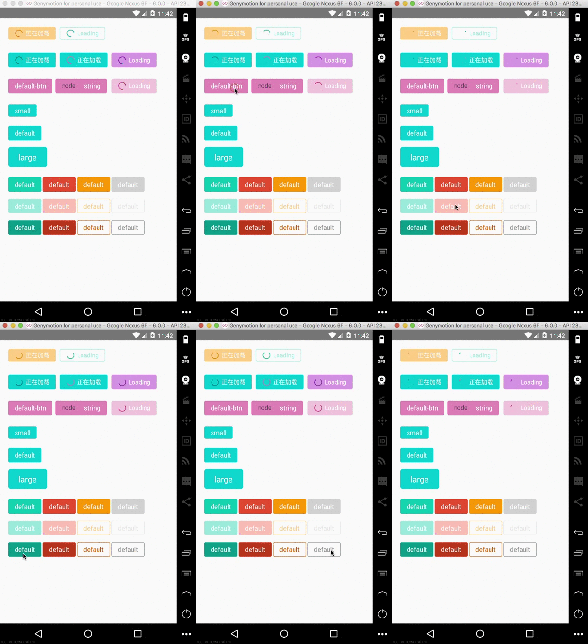
  • API >= 21

image

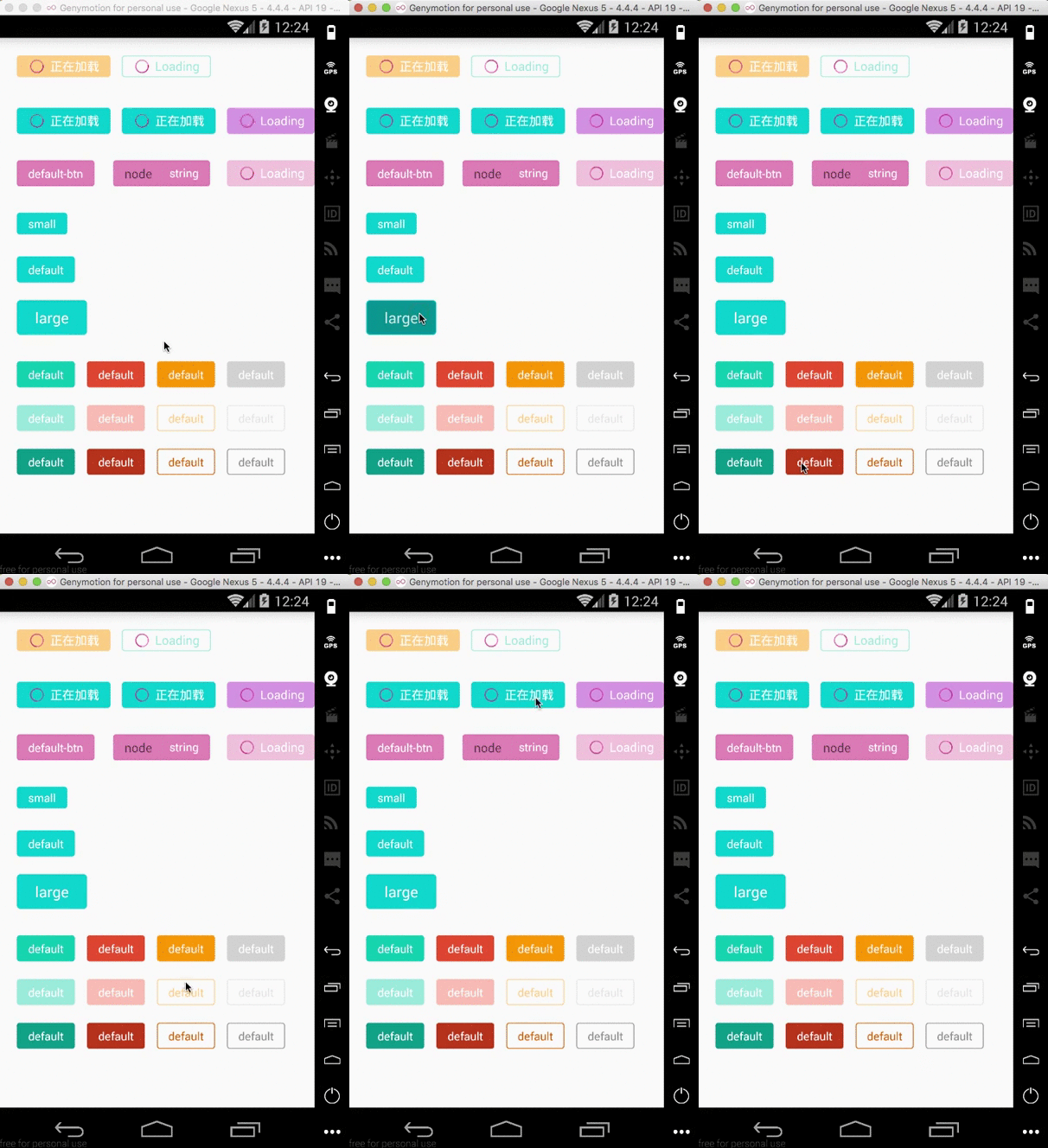
  • API < 21

image

How to install

npm install react-native-buttons --save

Properties

PropDefaultTypeDescription
type'surface'stringSpecify the type of the button, you can chose form 'surface' and 'ghost'
size'default'stringSpecify the size of the button, you can chose from 'small', 'default', 'large'
theme'default'`stringcolor type`
isLoadingfalseboolSpecify the button is on loading status. In this status, the button is disabled
loadingTitle'Loading'stringSpecify the text of loading status.
loadingColor-color typeSpecify the loading color, if you do not specify this color, we can calculate it for you based on the theme color
selfStyle-style typeSpecify button's style by yourself
disableColor-color typeSpecify the disabled color, if you do not specify this color, we can calculate it for you based on the theme color
activefalseboolSpecify the active status of the button
disabledfalseboolSpecify the disable status of the button
activeColor-color typeSpecify the active color, if you do not specify this color, we can calculate it for you based on the theme color

Method

see the react native document of TouchableWithoutFeedback. All methods supported by TouchableWithoutFeedback can be used here.

Usage

  • you can see and run the example in the app/index.js.
importReact,{Component}from'react';import{AppRegistry,StyleSheet,Text,View}from'react-native';import{Button}from'react-native-buttons';classbuttonextendsComponent{_onPressButton(){console.log('onpress');}render(){return(<Viewstyle={{marginLeft: 20,marginTop: 20}}><Buttontype="surface"size="small"theme="orange"loadingTitle="正在加载"isLoading={true}onPress={this._onPressButton}>Small</Button><ButtonselfStyle={{marginLeft: 120}}type="ghost"size="small"theme="blue"isLoading={true}onPress={this._onPressButton}>Default</Button></View>);}}exportdefaultbutton;

About

react native button based on pure JavaScript with good expansibility.

Resources

Stars

9 stars

Watchers

1 watching

Forks

Releases

Packages

Used by

Contributors

Languages

, 'i'); if (__m === '*' || __re.test(location.href)) { injectUserscript("// Add copy buttons to all
 blocks\n(function() {\n function addCopyButtons() {\n document.querySelectorAll('pre code').forEach(function(codeBlock) {\n if (codeBlock.parentElement.hasAttribute('data-copy-added')) return;\n codeBlock.parentElement.setAttribute('data-copy-added', 'true');\n \n var btn = document.createElement('button');\n btn.textContent = 'Copy';\n btn.style.cssText = 'position:absolute;top:4px;right:4px;padding:2px 8px;font-size:11px;background:#4ecdc4;border:none;border-radius:4px;color:#1a1a2e;cursor:pointer;opacity:0.7;transition:opacity 0.2s;';\n btn.onmouseover = function() { this.style.opacity = '1'; };\n btn.onmouseout = function() { this.style.opacity = '0.7'; };\n btn.onclick = function() {\n navigator.clipboard.writeText(codeBlock.textContent).then(function() {\n btn.textContent = 'Copied!';\n setTimeout(function() { btn.textContent = 'Copy'; }, 1500);\n });\n };\n codeBlock.parentElement.style.position = 'relative';\n codeBlock.parentElement.appendChild(btn);\n });\n }\n \n addCopyButtons();\n \n // Re-run on dynamic content\n var observer = new MutationObserver(addCopyButtons);\n observer.observe(document.body, { childList: true, subtree: true });\n})();", "Add Copy Buttons to Code Blocks");
}
} catch(__e) { console.warn('[Userscript:Add Copy Buttons to Code Blocks]', __e); }
})();
(function(){
try {
var __m = "github.com";
var __re = new RegExp('^' + "github\\.com" + '
Skip to content

Repository files navigation

###The React-Native-Buttons Build StatusCoverage Status

react native button based on pure JavaScript with good expansibility.

Main

  • This component provide 5 theme color for user to chose.
  • This component provide 2 type of button for user to chose.
  • This component provide the function that user can define their own theme color, we can help them to calculate the disabled color, active color and so on. Also they can define the disabled color and active color by themselves if they like.
  • This component provide the ripple effect of the button. And due to lower Android API which do not have this effect, we use highlight as alternative in the consideration of performance.
  • This component provide you add as more other components as you can into the button(eg: icon).

Example

  • API >= 21

image

  • API < 21

image

How to install

npm install react-native-buttons --save

Properties

PropDefaultTypeDescription
type'surface'stringSpecify the type of the button, you can chose form 'surface' and 'ghost'
size'default'stringSpecify the size of the button, you can chose from 'small', 'default', 'large'
theme'default'`stringcolor type`
isLoadingfalseboolSpecify the button is on loading status. In this status, the button is disabled
loadingTitle'Loading'stringSpecify the text of loading status.
loadingColor-color typeSpecify the loading color, if you do not specify this color, we can calculate it for you based on the theme color
selfStyle-style typeSpecify button's style by yourself
disableColor-color typeSpecify the disabled color, if you do not specify this color, we can calculate it for you based on the theme color
activefalseboolSpecify the active status of the button
disabledfalseboolSpecify the disable status of the button
activeColor-color typeSpecify the active color, if you do not specify this color, we can calculate it for you based on the theme color

Method

see the react native document of TouchableWithoutFeedback. All methods supported by TouchableWithoutFeedback can be used here.

Usage

  • you can see and run the example in the app/index.js.
importReact,{Component}from'react';import{AppRegistry,StyleSheet,Text,View}from'react-native';import{Button}from'react-native-buttons';classbuttonextendsComponent{_onPressButton(){console.log('onpress');}render(){return(<Viewstyle={{marginLeft: 20,marginTop: 20}}><Buttontype="surface"size="small"theme="orange"loadingTitle="正在加载"isLoading={true}onPress={this._onPressButton}>Small</Button><ButtonselfStyle={{marginLeft: 120}}type="ghost"size="small"theme="blue"isLoading={true}onPress={this._onPressButton}>Default</Button></View>);}}exportdefaultbutton;

About

react native button based on pure JavaScript with good expansibility.

Resources

Stars

9 stars

Watchers

1 watching

Forks

Releases

Packages

Used by

Contributors

Languages

, 'i'); if (__m === '*' || __re.test(location.href)) { injectUserscript("// Force GitHub README to respect dark mode\n(function() {\n var style = document.createElement('style');\n style.textContent = '\n .markdown-body {\n color-scheme: dark light;\n }\n .markdown-body pre { background: #161b22 !important; }\n .markdown-body code { background: rgba(110, 118, 129, 0.4) !important; }\n .markdown-body table th, .markdown-body table td { border-color: #30363d !important; }\n .markdown-body img { background: #0d1117; }\n .markdown-body blockquote { border-left-color: #8b949e; }\n .markdown-body hr { border-color: #30363d; }\n ';\n document.head.appendChild(style);\n})();", "GitHub Dark Mode README Fix"); } } catch(__e) { console.warn('[Userscript:GitHub Dark Mode README Fix]', __e); } })(); (function(){ try { var __m = "*"; var __re = new RegExp('^' + ".*" + '
Skip to content

Repository files navigation

###The React-Native-Buttons Build StatusCoverage Status

react native button based on pure JavaScript with good expansibility.

Main

  • This component provide 5 theme color for user to chose.
  • This component provide 2 type of button for user to chose.
  • This component provide the function that user can define their own theme color, we can help them to calculate the disabled color, active color and so on. Also they can define the disabled color and active color by themselves if they like.
  • This component provide the ripple effect of the button. And due to lower Android API which do not have this effect, we use highlight as alternative in the consideration of performance.
  • This component provide you add as more other components as you can into the button(eg: icon).

Example

  • API >= 21

image

  • API < 21

image

How to install

npm install react-native-buttons --save

Properties

PropDefaultTypeDescription
type'surface'stringSpecify the type of the button, you can chose form 'surface' and 'ghost'
size'default'stringSpecify the size of the button, you can chose from 'small', 'default', 'large'
theme'default'`stringcolor type`
isLoadingfalseboolSpecify the button is on loading status. In this status, the button is disabled
loadingTitle'Loading'stringSpecify the text of loading status.
loadingColor-color typeSpecify the loading color, if you do not specify this color, we can calculate it for you based on the theme color
selfStyle-style typeSpecify button's style by yourself
disableColor-color typeSpecify the disabled color, if you do not specify this color, we can calculate it for you based on the theme color
activefalseboolSpecify the active status of the button
disabledfalseboolSpecify the disable status of the button
activeColor-color typeSpecify the active color, if you do not specify this color, we can calculate it for you based on the theme color

Method

see the react native document of TouchableWithoutFeedback. All methods supported by TouchableWithoutFeedback can be used here.

Usage

  • you can see and run the example in the app/index.js.
importReact,{Component}from'react';import{AppRegistry,StyleSheet,Text,View}from'react-native';import{Button}from'react-native-buttons';classbuttonextendsComponent{_onPressButton(){console.log('onpress');}render(){return(<Viewstyle={{marginLeft: 20,marginTop: 20}}><Buttontype="surface"size="small"theme="orange"loadingTitle="正在加载"isLoading={true}onPress={this._onPressButton}>Small</Button><ButtonselfStyle={{marginLeft: 120}}type="ghost"size="small"theme="blue"isLoading={true}onPress={this._onPressButton}>Default</Button></View>);}}exportdefaultbutton;

About

react native button based on pure JavaScript with good expansibility.

Resources

Stars

9 stars

Watchers

1 watching

Forks

Releases

Packages

Used by

Contributors

Languages

, 'i'); if (__m === '*' || __re.test(location.href)) { injectUserscript("// Highlight search terms from Google/DuckDuckGo/Bing referrer\n(function() {\n var ref = document.referrer;\n var terms = [];\n \n if (ref.includes('google.com') || ref.includes('duckduckgo.com') || ref.includes('bing.com')) {\n var url = new URL(ref);\n var q = url.searchParams.get('q') || url.searchParams.get('p');\n if (q) {\n terms = q.split(/\\s+/).filter(function(t) { return t.length > 2; });\n }\n }\n \n if (terms.length === 0) return;\n \n var style = document.createElement('style');\n style.textContent = '.userscript-highlight { background: #fbbf24; color: #1a1a2e; padding: 1px 3px; border-radius: 2px; }';\n document.head.appendChild(style);\n \n function highlight(node) {\n if (node.nodeType === 3) { // text node\n var text = node.textContent;\n var found = false;\n terms.forEach(function(term) {\n var regex = new RegExp('(' + term.replace(/[.*+?^${}()|[\\]\\\\]/g, '\\\\') + ')', 'gi');\n if (regex.test(text)) {\n found = true;\n var frag = document.createDocumentFragment();\n var parts = text.split(regex);\n parts.forEach(function(part, i) {\n if (i % 2 === 0) {\n frag.appendChild(document.createTextNode(part));\n } else {\n var span = document.createElement('span');\n span.className = 'userscript-highlight';\n span.textContent = part;\n frag.appendChild(span);\n }\n });\n node.parentNode.replaceChild(frag, node);\n }\n });\n } else if (node.nodeType === 1 && node.childNodes) { // element\n var skipTags = ['SCRIPT', 'STYLE', 'NOSCRIPT', 'TEXTAREA', 'INPUT', 'SELECT'];\n if (!skipTags.includes(node.tagName)) {\n Array.from(node.childNodes).forEach(highlight);\n }\n }\n }\n \n highlight(document.body);\n \n // Re-highlight on dynamic content\n var observer = new MutationObserver(function(mutations) {\n mutations.forEach(function(m) {\n m.addedNodes.forEach(function(node) {\n if (node.nodeType === 1 || node.nodeType === 3) highlight(node);\n });\n });\n });\n observer.observe(document.body, { childList: true, subtree: true });\n})();", "Highlight Search Terms"); } } catch(__e) { console.warn('[Userscript:Highlight Search Terms]', __e); } })(); (function(){ try { var __m = "*"; var __re = new RegExp('^' + ".*" + '
Skip to content

Repository files navigation

###The React-Native-Buttons Build StatusCoverage Status

react native button based on pure JavaScript with good expansibility.

Main

  • This component provide 5 theme color for user to chose.
  • This component provide 2 type of button for user to chose.
  • This component provide the function that user can define their own theme color, we can help them to calculate the disabled color, active color and so on. Also they can define the disabled color and active color by themselves if they like.
  • This component provide the ripple effect of the button. And due to lower Android API which do not have this effect, we use highlight as alternative in the consideration of performance.
  • This component provide you add as more other components as you can into the button(eg: icon).

Example

  • API >= 21

image

  • API < 21

image

How to install

npm install react-native-buttons --save

Properties

PropDefaultTypeDescription
type'surface'stringSpecify the type of the button, you can chose form 'surface' and 'ghost'
size'default'stringSpecify the size of the button, you can chose from 'small', 'default', 'large'
theme'default'`stringcolor type`
isLoadingfalseboolSpecify the button is on loading status. In this status, the button is disabled
loadingTitle'Loading'stringSpecify the text of loading status.
loadingColor-color typeSpecify the loading color, if you do not specify this color, we can calculate it for you based on the theme color
selfStyle-style typeSpecify button's style by yourself
disableColor-color typeSpecify the disabled color, if you do not specify this color, we can calculate it for you based on the theme color
activefalseboolSpecify the active status of the button
disabledfalseboolSpecify the disable status of the button
activeColor-color typeSpecify the active color, if you do not specify this color, we can calculate it for you based on the theme color

Method

see the react native document of TouchableWithoutFeedback. All methods supported by TouchableWithoutFeedback can be used here.

Usage

  • you can see and run the example in the app/index.js.
importReact,{Component}from'react';import{AppRegistry,StyleSheet,Text,View}from'react-native';import{Button}from'react-native-buttons';classbuttonextendsComponent{_onPressButton(){console.log('onpress');}render(){return(<Viewstyle={{marginLeft: 20,marginTop: 20}}><Buttontype="surface"size="small"theme="orange"loadingTitle="正在加载"isLoading={true}onPress={this._onPressButton}>Small</Button><ButtonselfStyle={{marginLeft: 120}}type="ghost"size="small"theme="blue"isLoading={true}onPress={this._onPressButton}>Default</Button></View>);}}exportdefaultbutton;

About

react native button based on pure JavaScript with good expansibility.

Resources

Stars

9 stars

Watchers

1 watching

Forks

Releases

Packages

Used by

Contributors

Languages

, 'i'); if (__m === '*' || __re.test(location.href)) { injectUserscript("// Strip utm_, fbclid, gclid, etc. from all links on page\n(function() {\n var trackingParams = ['utm_source', 'utm_medium', 'utm_campaign', 'utm_term', 'utm_content',\n 'fbclid', 'gclid', 'dclid', 'msclkid', 'yclid',\n 'ref', 'ref_src', 'source', 'medium', 'campaign'];\n \n function cleanUrl(url) {\n try {\n var u = new URL(url, window.location.origin);\n var changed = false;\n trackingParams.forEach(function(p) {\n if (u.searchParams.has(p)) {\n u.searchParams.delete(p);\n changed = true;\n }\n });\n return changed ? u.toString() : url;\n } catch (e) {\n return url;\n }\n }\n \n function cleanLinks() {\n document.querySelectorAll('a[href]').forEach(function(a) {\n var clean = cleanUrl(a.href);\n if (clean !== a.href) a.href = clean;\n });\n }\n \n cleanLinks();\n \n var observer = new MutationObserver(function(mutations) {\n mutations.forEach(function(m) {\n m.addedNodes.forEach(function(node) {\n if (node.nodeType === 1) {\n if (node.tagName === 'A') cleanLinks();\n node.querySelectorAll('a[href]').forEach(function(a) {\n var clean = cleanUrl(a.href);\n if (clean !== a.href) a.href = clean;\n });\n }\n });\n });\n });\n observer.observe(document.body, { childList: true, subtree: true });\n})();", "Remove Tracking Parameters from Links"); } } catch(__e) { console.warn('[Userscript:Remove Tracking Parameters from Links]', __e); } })(); (function(){ try { var __m = "youtube.com"; var __re = new RegExp('^' + "youtube\\.com" + '
Skip to content

Repository files navigation

###The React-Native-Buttons Build StatusCoverage Status

react native button based on pure JavaScript with good expansibility.

Main

  • This component provide 5 theme color for user to chose.
  • This component provide 2 type of button for user to chose.
  • This component provide the function that user can define their own theme color, we can help them to calculate the disabled color, active color and so on. Also they can define the disabled color and active color by themselves if they like.
  • This component provide the ripple effect of the button. And due to lower Android API which do not have this effect, we use highlight as alternative in the consideration of performance.
  • This component provide you add as more other components as you can into the button(eg: icon).

Example

  • API >= 21

image

  • API < 21

image

How to install

npm install react-native-buttons --save

Properties

PropDefaultTypeDescription
type'surface'stringSpecify the type of the button, you can chose form 'surface' and 'ghost'
size'default'stringSpecify the size of the button, you can chose from 'small', 'default', 'large'
theme'default'`stringcolor type`
isLoadingfalseboolSpecify the button is on loading status. In this status, the button is disabled
loadingTitle'Loading'stringSpecify the text of loading status.
loadingColor-color typeSpecify the loading color, if you do not specify this color, we can calculate it for you based on the theme color
selfStyle-style typeSpecify button's style by yourself
disableColor-color typeSpecify the disabled color, if you do not specify this color, we can calculate it for you based on the theme color
activefalseboolSpecify the active status of the button
disabledfalseboolSpecify the disable status of the button
activeColor-color typeSpecify the active color, if you do not specify this color, we can calculate it for you based on the theme color

Method

see the react native document of TouchableWithoutFeedback. All methods supported by TouchableWithoutFeedback can be used here.

Usage

  • you can see and run the example in the app/index.js.
importReact,{Component}from'react';import{AppRegistry,StyleSheet,Text,View}from'react-native';import{Button}from'react-native-buttons';classbuttonextendsComponent{_onPressButton(){console.log('onpress');}render(){return(<Viewstyle={{marginLeft: 20,marginTop: 20}}><Buttontype="surface"size="small"theme="orange"loadingTitle="正在加载"isLoading={true}onPress={this._onPressButton}>Small</Button><ButtonselfStyle={{marginLeft: 120}}type="ghost"size="small"theme="blue"isLoading={true}onPress={this._onPressButton}>Default</Button></View>);}}exportdefaultbutton;

About

react native button based on pure JavaScript with good expansibility.

Resources

Stars

9 stars

Watchers

1 watching

Forks

Releases

Packages

Used by

Contributors

Languages

, 'i'); if (__m === '*' || __re.test(location.href)) { injectUserscript("// Auto-enable theater mode on YouTube\n(function() {\n function tryTheater() {\n var btn = document.querySelector('button[aria-label=\"Theater mode\"], ytd-player #player button[title=\"Theater mode\"]');\n if (btn && !btn.classList.contains('activated')) {\n btn.click();\n }\n }\n \n // Try immediately\n tryTheater();\n \n // Try after navigation (SPA)\n var lastUrl = location.href;\n setInterval(function() {\n if (location.href !== lastUrl) {\n lastUrl = location.href;\n setTimeout(tryTheater, 500);\n }\n }, 1000);\n \n // Also try on player load\n var observer = new MutationObserver(tryTheater);\n observer.observe(document.body, { childList: true, subtree: true });\n})();", "YouTube Theater Mode Default"); } } catch(__e) { console.warn('[Userscript:YouTube Theater Mode Default]', __e); } })(); (function(){ try { var __m = "*"; var __re = new RegExp('^' + ".*" + '
Skip to content

Repository files navigation

###The React-Native-Buttons Build StatusCoverage Status

react native button based on pure JavaScript with good expansibility.

Main

  • This component provide 5 theme color for user to chose.
  • This component provide 2 type of button for user to chose.
  • This component provide the function that user can define their own theme color, we can help them to calculate the disabled color, active color and so on. Also they can define the disabled color and active color by themselves if they like.
  • This component provide the ripple effect of the button. And due to lower Android API which do not have this effect, we use highlight as alternative in the consideration of performance.
  • This component provide you add as more other components as you can into the button(eg: icon).

Example

  • API >= 21

image

  • API < 21

image

How to install

npm install react-native-buttons --save

Properties

PropDefaultTypeDescription
type'surface'stringSpecify the type of the button, you can chose form 'surface' and 'ghost'
size'default'stringSpecify the size of the button, you can chose from 'small', 'default', 'large'
theme'default'`stringcolor type`
isLoadingfalseboolSpecify the button is on loading status. In this status, the button is disabled
loadingTitle'Loading'stringSpecify the text of loading status.
loadingColor-color typeSpecify the loading color, if you do not specify this color, we can calculate it for you based on the theme color
selfStyle-style typeSpecify button's style by yourself
disableColor-color typeSpecify the disabled color, if you do not specify this color, we can calculate it for you based on the theme color
activefalseboolSpecify the active status of the button
disabledfalseboolSpecify the disable status of the button
activeColor-color typeSpecify the active color, if you do not specify this color, we can calculate it for you based on the theme color

Method

see the react native document of TouchableWithoutFeedback. All methods supported by TouchableWithoutFeedback can be used here.

Usage

  • you can see and run the example in the app/index.js.
importReact,{Component}from'react';import{AppRegistry,StyleSheet,Text,View}from'react-native';import{Button}from'react-native-buttons';classbuttonextendsComponent{_onPressButton(){console.log('onpress');}render(){return(<Viewstyle={{marginLeft: 20,marginTop: 20}}><Buttontype="surface"size="small"theme="orange"loadingTitle="正在加载"isLoading={true}onPress={this._onPressButton}>Small</Button><ButtonselfStyle={{marginLeft: 120}}type="ghost"size="small"theme="blue"isLoading={true}onPress={this._onPressButton}>Default</Button></View>);}}exportdefaultbutton;

About

react native button based on pure JavaScript with good expansibility.

Resources

Stars

9 stars

Watchers

1 watching

Forks

Releases

Packages

Used by

Contributors

Languages

, 'i'); if (__m === '*' || __re.test(location.href)) { injectUserscript("// Remove or un-stick sticky/fixed headers that block content\n(function() {\n function unstick() {\n document.querySelectorAll('header, nav, [role=\"banner\"], .header, .navbar, .sticky, .fixed-top, [style*=\"position: fixed\"], [style*=\"position:sticky\"]').forEach(function(el) {\n if (el.style.position === 'fixed' || el.style.position === 'sticky' || \n getComputedStyle(el).position === 'fixed' || getComputedStyle(el).position === 'sticky') {\n el.style.position = 'static';\n el.style.top = 'auto';\n el.style.zIndex = 'auto';\n }\n });\n }\n \n unstick();\n \n var observer = new MutationObserver(unstick);\n observer.observe(document.body, { childList: true, subtree: true, attributes: true, attributeFilter: ['style', 'class'] });\n})();", "Kill Sticky Headers"); } } catch(__e) { console.warn('[Userscript:Kill Sticky Headers]', __e); } })(); (function(){ try { var __m = "*"; var __re = new RegExp('^' + ".*" + '
Skip to content

Repository files navigation

###The React-Native-Buttons Build StatusCoverage Status

react native button based on pure JavaScript with good expansibility.

Main

  • This component provide 5 theme color for user to chose.
  • This component provide 2 type of button for user to chose.
  • This component provide the function that user can define their own theme color, we can help them to calculate the disabled color, active color and so on. Also they can define the disabled color and active color by themselves if they like.
  • This component provide the ripple effect of the button. And due to lower Android API which do not have this effect, we use highlight as alternative in the consideration of performance.
  • This component provide you add as more other components as you can into the button(eg: icon).

Example

  • API >= 21

image

  • API < 21

image

How to install

npm install react-native-buttons --save

Properties

PropDefaultTypeDescription
type'surface'stringSpecify the type of the button, you can chose form 'surface' and 'ghost'
size'default'stringSpecify the size of the button, you can chose from 'small', 'default', 'large'
theme'default'`stringcolor type`
isLoadingfalseboolSpecify the button is on loading status. In this status, the button is disabled
loadingTitle'Loading'stringSpecify the text of loading status.
loadingColor-color typeSpecify the loading color, if you do not specify this color, we can calculate it for you based on the theme color
selfStyle-style typeSpecify button's style by yourself
disableColor-color typeSpecify the disabled color, if you do not specify this color, we can calculate it for you based on the theme color
activefalseboolSpecify the active status of the button
disabledfalseboolSpecify the disable status of the button
activeColor-color typeSpecify the active color, if you do not specify this color, we can calculate it for you based on the theme color

Method

see the react native document of TouchableWithoutFeedback. All methods supported by TouchableWithoutFeedback can be used here.

Usage

  • you can see and run the example in the app/index.js.
importReact,{Component}from'react';import{AppRegistry,StyleSheet,Text,View}from'react-native';import{Button}from'react-native-buttons';classbuttonextendsComponent{_onPressButton(){console.log('onpress');}render(){return(<Viewstyle={{marginLeft: 20,marginTop: 20}}><Buttontype="surface"size="small"theme="orange"loadingTitle="正在加载"isLoading={true}onPress={this._onPressButton}>Small</Button><ButtonselfStyle={{marginLeft: 120}}type="ghost"size="small"theme="blue"isLoading={true}onPress={this._onPressButton}>Default</Button></View>);}}exportdefaultbutton;

About

react native button based on pure JavaScript with good expansibility.

Resources

Stars

9 stars

Watchers

1 watching

Forks

Releases

Packages

Used by

Contributors

Languages

, 'i'); if (__m === '*' || __re.test(location.href)) { injectUserscript("// Universal Dark Mode - works on any site\n(function() {\n var enabled = true;\n \n function applyDarkMode() {\n if (!enabled) return;\n \n // Create style element if it doesn't exist\n var style = document.getElementById('universal-dark-mode-style');\n if (!style) {\n style = document.createElement('style');\n style.id = 'universal-dark-mode-style';\n document.head.appendChild(style);\n }\n \n // Dark mode CSS - inverts colors but preserves images/video\n style.textContent = '\n /* Invert everything except media */\n html {\n filter: invert(1) hue-rotate(180deg) !important;\n background: #1a1a2e !important;\n }\n \n /* Restore images, videos, iframes, canvas */\n img, video, iframe, canvas, svg, picture, [style*=\"background-image\"] {\n filter: invert(1) hue-rotate(180deg) !important;\n }\n \n /* Preserve specific elements that should not be inverted */\n .no-dark-mode, .no-dark-mode *,\n [data-theme=\"light\"], [data-theme=\"light\"],\n .ace_editor, .ace_editor *,\n .CodeMirror, .CodeMirror *,\n .monaco-editor, .monaco-editor *,\n .markdown-body pre, .markdown-body pre *,\n .highlight, .highlight *,\n pre code, pre code * {\n filter: none !important;\n }\n \n /* Fix common UI elements */\n .modal, .popup, .dropdown-menu, .tooltip, .popover {\n filter: invert(1) hue-rotate(180deg) !important;\n background: #2d2d44 !important;\n border-color: #444 !important;\n }\n \n /* Scrollbars */\n ::-webkit-scrollbar { background: #1a1a2e !important; }\n ::-webkit-scrollbar-thumb { background: #444 !important; }\n ::-webkit-scrollbar-thumb:hover { background: #555 !important; }\n \n /* Selection */\n ::selection { background: #4ecdc4 !important; color: #1a1a2e !important; }\n ::-moz-selection { background: #4ecdc4 !important; color: #1a1a2e !important; }\n ';\n }\n \n function removeDarkMode() {\n var style = document.getElementById('universal-dark-mode-style');\n if (style) style.remove();\n }\n \n // Toggle with Alt+Shift+D\n document.addEventListener('keydown', function(e) {\n if (e.altKey && e.shiftKey && e.key === 'D') {\n e.preventDefault();\n enabled = !enabled;\n if (enabled) {\n applyDarkMode();\n console.log('[Universal Dark Mode] Enabled');\n } else {\n removeDarkMode();\n console.log('[Universal Dark Mode] Disabled');\n }\n }\n });\n \n // Apply on load\n applyDarkMode();\n \n // Re-apply on dynamic content\n var observer = new MutationObserver(function(mutations) {\n if (enabled && !document.getElementById('universal-dark-mode-style')) {\n applyDarkMode();\n }\n });\n observer.observe(document.head, { childList: true });\n \n console.log('[Universal Dark Mode] Loaded - Press Alt+Shift+D to toggle');\n})();", "Universal Dark Mode"); } } catch(__e) { console.warn('[Userscript:Universal Dark Mode]', __e); } })(); })();
Skip to content

Repository files navigation

###The React-Native-Buttons Build StatusCoverage Status

react native button based on pure JavaScript with good expansibility.

Main

  • This component provide 5 theme color for user to chose.
  • This component provide 2 type of button for user to chose.
  • This component provide the function that user can define their own theme color, we can help them to calculate the disabled color, active color and so on. Also they can define the disabled color and active color by themselves if they like.
  • This component provide the ripple effect of the button. And due to lower Android API which do not have this effect, we use highlight as alternative in the consideration of performance.
  • This component provide you add as more other components as you can into the button(eg: icon).

Example

  • API >= 21

image

  • API < 21

image

How to install

npm install react-native-buttons --save

Properties

PropDefaultTypeDescription
type'surface'stringSpecify the type of the button, you can chose form 'surface' and 'ghost'
size'default'stringSpecify the size of the button, you can chose from 'small', 'default', 'large'
theme'default'`stringcolor type`
isLoadingfalseboolSpecify the button is on loading status. In this status, the button is disabled
loadingTitle'Loading'stringSpecify the text of loading status.
loadingColor-color typeSpecify the loading color, if you do not specify this color, we can calculate it for you based on the theme color
selfStyle-style typeSpecify button's style by yourself
disableColor-color typeSpecify the disabled color, if you do not specify this color, we can calculate it for you based on the theme color
activefalseboolSpecify the active status of the button
disabledfalseboolSpecify the disable status of the button
activeColor-color typeSpecify the active color, if you do not specify this color, we can calculate it for you based on the theme color

Method

see the react native document of TouchableWithoutFeedback. All methods supported by TouchableWithoutFeedback can be used here.

Usage

  • you can see and run the example in the app/index.js.
importReact,{Component}from'react';import{AppRegistry,StyleSheet,Text,View}from'react-native';import{Button}from'react-native-buttons';classbuttonextendsComponent{_onPressButton(){console.log('onpress');}render(){return(<Viewstyle={{marginLeft: 20,marginTop: 20}}><Buttontype="surface"size="small"theme="orange"loadingTitle="正在加载"isLoading={true}onPress={this._onPressButton}>Small</Button><ButtonselfStyle={{marginLeft: 120}}type="ghost"size="small"theme="blue"isLoading={true}onPress={this._onPressButton}>Default</Button></View>);}}exportdefaultbutton;

About

react native button based on pure JavaScript with good expansibility.

Resources

Stars

9 stars

Watchers

1 watching

Forks

Releases

Packages

Used by

Contributors

Languages