Easy API for forest plots.
A Python package to make publication-ready but customizable forest plots.

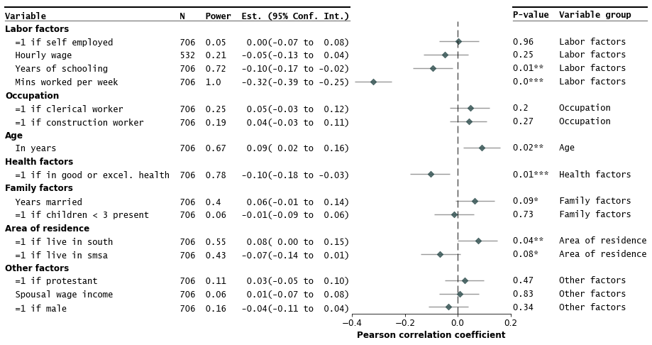
This package makes publication-ready forest plots easy to make out-of-the-box. Users provide a dataframe (e.g. from a spreadsheet) where rows correspond to a variable/study with columns including estimates, variable labels, and lower and upper confidence interval limits.
Additional options allow easy addition of columns in the dataframe as annotations in the plot.
| Release |    |
| Status |   |
| Coverage |  |
| Python |  |
| Docs |   |
| Meta |      |
| Binder |  |

show/hide
Install from PyPI
pip install forestplotInstall from conda-forge
conda install forestplotInstall from source
git clone https://github.com/LSYS/forestplot.git
cd forestplot
pip install .
Developer installation
git clone https://github.com/LSYS/forestplot.git
cd forestplot
pip install -r requirements_dev.txt
make lint
make testimportforestplotasfpdf=fp.load_data("sleep") # companion example datadf.head(3)| var | r | moerror | label | group | ll | hl | n | power | p-val | |
|---|---|---|---|---|---|---|---|---|---|---|
| 0 | age | 0.0903729 | 0.0696271 | in years | age | 0.02 | 0.16 | 706 | 0.671578 | 0.0163089 |
| 1 | black | -0.0270573 | 0.0770573 | =1 if black | other factors | -0.1 | 0.05 | 706 | 0.110805 | 0.472889 |
| 2 | clerical | 0.0480811 | 0.0719189 | =1 if clerical worker | occupation | -0.03 | 0.12 | 706 | 0.247768 | 0.201948 |
(* This is a toy example of how certain factors correlate with the amount of sleep one gets. See the notebook that generates the data.)
The example input dataframe above have 4 key columns
| Column | Description | Required |
|---|---|---|
var | Variable label | ✓ |
r | Correlation coefficients (estimates to plot) | ✓ |
label | Variable labels | ✓ |
group | Variable grouping labels | |
ll | Conf. int. lower limits | |
hl | Containing the conf. int. higher limits | |
n | Sample size | |
power | Statistical power | |
p-val | P-value |
(See Gallery and API Options for more details on required and optional arguments.)
Make the forest plot
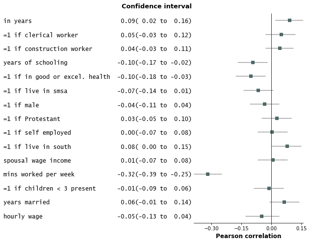
fp.forestplot(df, # the dataframe with results dataestimate="r", # col containing estimated effect size ll="ll", hl="hl", # columns containing conf. int. lower and higher limitsvarlabel="label", # column containing variable labelylabel="Confidence interval", # y-label titlexlabel="Pearson correlation", # x-label title
)
Save the plot
plt.savefig("plot.png", bbox_inches="tight")- Add variable groupings, add group order, and sort by estimate size.
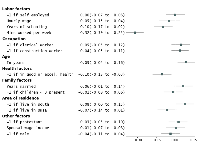
fp.forestplot(df, # the dataframe with results dataestimate="r", # col containing estimated effect size ll="ll", hl="hl", # columns containing conf. int. lower and higher limits varlabel="label", # column containing variable labelcapitalize="capitalize", # Capitalize labelsgroupvar="group", # Add variable groupings # group orderinggroup_order=["labor factors", "occupation", "age", "health factors", "family factors", "area of residence", "other factors"],
sort=True# sort in ascending order (sorts within group if group is specified)
)
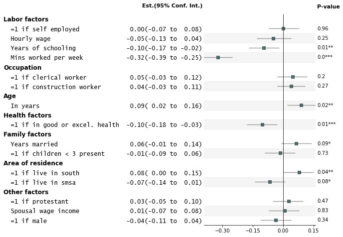
- Add p-values on the right and color alternate rows gray
fp.forestplot(df, # the dataframe with results dataestimate="r", # col containing estimated effect size ll="ll", hl="hl", # columns containing conf. int. lower and higher limitsvarlabel="label", # column containing variable labelcapitalize="capitalize", # Capitalize labelsgroupvar="group", # Add variable groupings # group orderinggroup_order=["labor factors", "occupation", "age", "health factors", "family factors", "area of residence", "other factors"],
sort=True, # sort in ascending order (sorts within group if group is specified) pval="p-val", # Column of p-value to be reported on rightcolor_alt_rows=True, # Gray alternate rowsylabel="Est.(95% Conf. Int.)", # ylabel to print**{"ylabel1_size": 11} # control size of printed ylabel
)
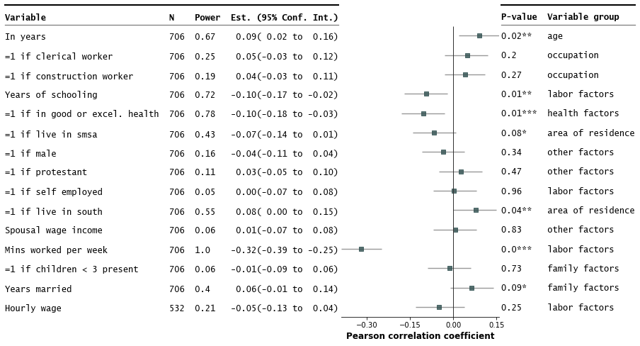
- Customize annotations and make it a table
fp.forestplot(df, # the dataframe with results dataestimate="r", # col containing estimated effect size ll="ll", hl="hl", # lower & higher limits of conf. int.varlabel="label", # column containing the varlabels to be printed on far leftcapitalize="capitalize", # Capitalize labelspval="p-val", # column containing p-values to be formattedannote=["n", "power", "est_ci"], # columns to report on left of plotannoteheaders=["N", "Power", "Est. (95% Conf. Int.)"], # ^corresponding headersrightannote=["formatted_pval", "group"], # columns to report on right of plot right_annoteheaders=["P-value", "Variable group"], # ^corresponding headersxlabel="Pearson correlation coefficient", # x-label titletable=True, # Format as a table
)
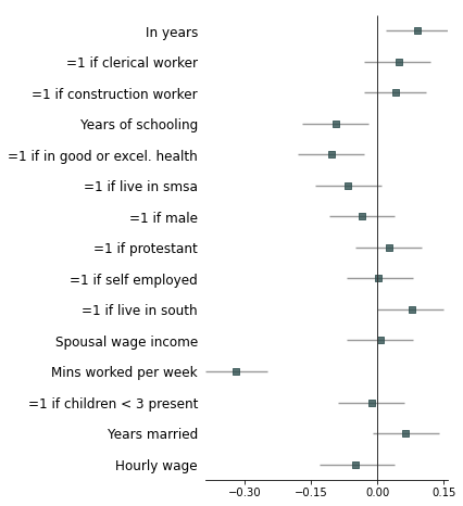
- Strip down all bells and whistle
fp.forestplot(df, # the dataframe with results dataestimate="r", # col containing estimated effect size ll="ll", hl="hl", # lower & higher limits of conf. int.varlabel="label", # column containing the varlabels to be printed on far leftcapitalize="capitalize", # Capitalize labelsci_report=False, # Turn off conf. int. reportingflush=False, # Turn off left-flush of text**{'fontfamily': 'sans-serif'} # revert to sans-serif
)
- Example with more customizations
fp.forestplot(df, # the dataframe with results dataestimate="r", # col containing estimated effect size ll="ll", hl="hl", # lower & higher limits of conf. int.varlabel="label", # column containing the varlabels to be printed on far leftcapitalize="capitalize", # Capitalize labelspval="p-val", # column containing p-values to be formattedannote=["n", "power", "est_ci"], # columns to report on left of plotannoteheaders=["N", "Power", "Est. (95% Conf. Int.)"], # ^corresponding headersrightannote=["formatted_pval", "group"], # columns to report on right of plot right_annoteheaders=["P-value", "Variable group"], # ^corresponding headersgroupvar="group", # column containing group labelsgroup_order=["labor factors", "occupation", "age", "health factors", "family factors", "area of residence", "other factors"], xlabel="Pearson correlation coefficient", # x-label titlexticks=[-.4,-.2,0, .2], # x-ticks to be printedsort=True, # sort estimates in ascending ordertable=True, # Format as a table# Additional kwargs for customizations**{"marker": "D", # set maker symbol as diamond"markersize": 35, # adjust marker size"xlinestyle": (0, (10, 5)), # long dash for x-reference line "xlinecolor": "#808080", # gray color for x-reference line"xtick_size": 12, # adjust x-ticker fontsize
} )
Annotations arguments allowed include:
ci_range: Confidence interval range (e.g.(-0.39 to -0.25)).est_ci: Estimate and CI (e.g.-0.32(-0.39 to -0.25)).formatted_pval: Formatted p-values (e.g.0.01**).
To confirm what processed columns are available as annotations, you can do:
processed_df, ax=fp.forestplot(df, ... # other arguments herereturn_df=True# return processed dataframe with processed columns
)
processed_df.head(3)| label | group | n | r | CI95% | p-val | BF10 | power | var | hl | ll | moerror | formatted_r | formatted_ll | formatted_hl | ci_range | est_ci | formatted_pval | formatted_n | formatted_power | formatted_est_ci | yticklabel | formatted_formatted_pval | formatted_group | yticklabel2 | |
|---|---|---|---|---|---|---|---|---|---|---|---|---|---|---|---|---|---|---|---|---|---|---|---|---|---|
| 0 | Mins worked per week | Labor factors | 706 | -0.321384 | [-0.39 -0.25] | 1.99409e-18 | 1.961e+15 | 1 | totwrk | -0.25 | -0.39 | 0.0686165 | -0.32 | -0.39 | -0.25 | (-0.39 to -0.25) | -0.32(-0.39 to -0.25) | 0.0*** | 706 | 1 | -0.32(-0.39 to -0.25) | Mins worked per week 706 1.0 -0.32(-0.39 to -0.25) | 0.0*** | Labor factors | 0.0*** Labor factors |
| 1 | Years of schooling | Labor factors | 706 | -0.0950039 | [-0.17 -0.02] | 0.0115515 | 1.137 | 0.72 | educ | -0.02 | -0.17 | 0.0749961 | -0.1 | -0.17 | -0.02 | (-0.17 to -0.02) | -0.10(-0.17 to -0.02) | 0.01** | 706 | 0.72 | -0.10(-0.17 to -0.02) | Years of schooling 706 0.72 -0.10(-0.17 to -0.02) | 0.01** | Labor factors | 0.01** Labor factors |
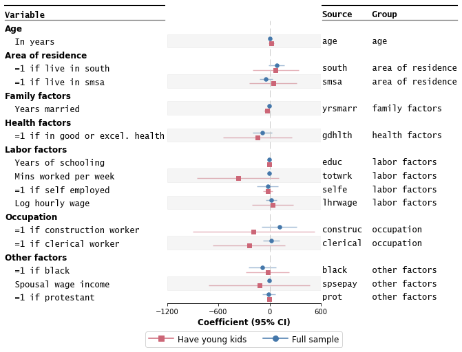
For coefficient plots where each variable can have multiple estimates (each model has one).
importforestplotasfpdf_mmodel=pd.read_csv("../examples/data/sleep-mmodel.csv").query(
"model=='all' | model=='young kids'"
)
df_mmodel.head(3)| var | coef | se | T | pval | r2 | adj_r2 | ll | hl | model | group | label | |
|---|---|---|---|---|---|---|---|---|---|---|---|---|
| 0 | age | 0.994889 | 1.96925 | 0.505213 | 0.613625 | 0.127289 | 0.103656 | -2.87382 | 4.8636 | all | age | in years |
| 3 | age | 22.634 | 15.4953 | 1.4607 | 0.149315 | 0.178147 | -0.0136188 | -8.36124 | 53.6293 | young kids | age | in years |
| 4 | black | -84.7966 | 82.1501 | -1.03222 | 0.302454 | 0.127289 | 0.103656 | -246.186 | 76.5925 | all | other factors | =1 if black |
fp.mforestplot(
dataframe=df_mmodel,
estimate="coef",
ll="ll",
hl="hl",
varlabel="label",
capitalize="capitalize",
model_col="model",
color_alt_rows=True,
groupvar="group",
table=True,
rightannote=["var", "group"],
right_annoteheaders=["Source", "Group"],
xlabel="Coefficient (95% CI)",
modellabels=["Have young kids", "Full sample"],
xticks=[-1200, -600, 0, 600],
mcolor=["#CC6677", "#4477AA"],
# Additional kwargs for customizations**{
"markersize": 30,
# override default vertical offset between models (0.0 to 1.0)"offset": 0.35, "xlinestyle": (0, (10, 5)), # long dash for x-reference line"xlinecolor": ".8", # gray color for x-reference line
},
)
Please note: This module is still experimental. See this jupyter notebook for more examples and tweaks.
Check out this jupyter notebook for a gallery variations of forest plots possible out-of-the-box. The table below shows the list of arguments users can pass in. More fined-grained control for base plot options (eg font sizes, marker colors) can be inferred from the example notebook gallery.
| Option | Description | Required |
|---|---|---|
dataframe | Pandas dataframe where rows are variables (or studies for meta-analyses) and columns include estimated effect sizes, labels, and confidence intervals, etc. | ✓ |
estimate | Name of column in dataframe containing the estimates. | ✓ |
varlabel | Name of column in dataframe containing the variable labels (study labels if meta-analyses). | ✓ |
ll | Name of column in dataframe containing the conf. int. lower limits. | |
hl | Name of column in dataframe containing the conf. int. higher limits. | |
logscale | If True, make the x-axis log scale. Default is False. | |
capitalize | How to capitalize strings. Default is None. One of "capitalize", "title", "lower", "upper", "swapcase". | |
form_ci_report | If True (default), report the estimates and confidence interval beside the variable labels. | |
ci_report | If True (default), format the confidence interval as a string. | |
groupvar | Name of column in dataframe containing the variable grouping labels. | |
group_order | List of group labels indicating the order of groups to report in the plot. | |
annote | List of columns to add as annotations on the left-hand side of the plot. | |
annoteheaders | List of column headers for the left-hand side annotations. | |
rightannote | List of columns to add as annotations on the right-hand side of the plot. | |
right_annoteheaders | List of column headers for the right-hand side annotations. | |
pval | Name of column in dataframe containing the p-values. | |
starpval | If True (default), format p-values with stars indicating statistical significance. | |
sort | If True, sort variables by estimate values in ascending order. | |
sortby | Name of column to sort by. Default is estimate. | |
flush | If True (default), left-flush variable labels and annotations. | |
decimal_precision | Number of decimal places to print. (Default = 2) | |
figsize | Tuple indicating core figure size. Default is (4, 8) | |
xticks | List of xticklabels to print on x-axis. | |
ylabel | Y-label title. | |
xlabel | X-label title. | |
color_alt_rows | If True, shade out alternating rows in gray. | |
preprocess | If True (default), preprocess the dataframe before plotting. | |
return_df | If True, returned the preprocessed dataframe. |
- Variable labels coinciding with group variables may lead to unexpected formatting issues in the graph.
- Left-flushing of annotations relies on the
monospacefont. - Plot may give strange behavior for few rows of data (six rows or fewer. see this issue)
- Plot can get cluttered with too many variables/rows (~30 onwards)
- Not tested with PyCharm (#80) nor Google Colab (#110).
- Duplicated
varlabelmay lead to unexpected results (see #76, #81).mplotfor grouped models could be useful for such cases (see #59, WIP).
More about forest plots
Forest plots have many aliases (h/t Chris Alexiuk). Other names include coefplots, coefficient plots, meta-analysis plots, dot-and-whisker plots, blobbograms, margins plots, regression plots, and ropeladder plots.
Forest plots in the medical and health sciences literature are plots that report results from different studies as a meta-analysis. Markers are centered on the estimated effect and horizontal lines running through each marker depicts the confidence intervals.
The simplest version of a forest plot has two columns: one for the variables/studies, and the second for the estimated coefficients and confidence intervals. This layout is similar to coefficient plots (coefplots) and is thus useful for more than meta-analyses.
More resources about forest plots
More about this package
The package is lightweight, built on pandas, numpy, and matplotlib.
It is slightly opinioniated in that the aesthetics of the plot inherits some of my sensibilities about what makes a nice figure.
You can however easily override most defaults for the look of the graph. This is possible via **kwargs in the forestplot API (see Gallery and API options) and the matplotlib API.
Planned enhancements include forest plots where each row can have multiple coefficients (e.g. from multiple models).
Related packages
- [1] [Stata] Jann, Ben (2014). Plotting regression coefficients and other estimates. The Stata Journal 14(4): 708-737.
- [2] [Python] Meta-Analysis in statsmodels
- [3] [Python] Matt Bracher-Smith's Forestplot
- [4] [R] Solt, Frederick and Hu, Yue (2021) dotwhisker: Dot-and-Whisker Plots of Regression Results
- [5] [R] Bounthavong, Mark (2021) Forest plots. RPubs by RStudio
Contributions are welcome, and they are greatly appreciated!
Potential ways to contribute:
- Raise issues/bugs/questions
- Write tests for missing coverage
- Add features (see examples notebook for a survey of existing features)
- Add example datasets with companion graphs
- Add your graphs with companion code
Issues
Please submit bugs, questions, or issues you encounter to the GitHub Issue Tracker. For bugs, please provide a minimal reproducible example demonstrating the problem (it may help me troubleshoot if I have a version of your data).
Pull Requests
Please feel free to open an issue on the Issue Tracker if you'd like to discuss potential contributions via PRs.