Uh oh!
There was an error while loading. Please reload this page.
Design fixes - #89
Conversation
Signed-off-by: Jan-Christoph Borchardt <hey@jancborchardt.net>
Signed-off-by: Jan-Christoph Borchardt <hey@jancborchardt.net>
…yout
Signed-off-by: Jan-Christoph Borchardt <hey@jancborchardt.net>
MariusBluem
commented
Aug 13, 2017
Can we add a space between the text and the buttons? @jancborchardt |
raimund-schluessler
commented
Aug 13, 2017
I also find the before lineheight to narrow, but afterwards it looks like four separate sections. Could there be something in between? |
 skjnldsv
left a comment
skjnldsv
left a comment
There was a problem hiding this comment.
I want to change my mind a bit, I find the space between paragraph a little bit too big! :)
nickvergessen
commented
Aug 14, 2017
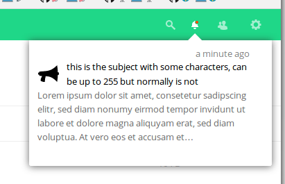
I'd vote for a bit more space between subject and message: I will also fix the notification of the survey app, that long subject should be the message and have a short subject instead. |
jancborchardt
commented
Aug 14, 2017
@nickvergessen actually the space is good and should stay that way for vertical rhythm. However the title should probably be semibold. Will fix the details. |
The space between the rows of the headline is more than between headline and message... I think thats awkward |
pixelipo
commented
Aug 16, 2017
I agree with @nickvergessen 's las comment - line height shouldn't be larger than paragraph margin/padding: |

nickvergessen
commented
Nov 1, 2017
@jancborchardt are you going to do something here until Nextcloud 13? |
jancborchardt
commented
Nov 1, 2017
I would say we should merge as it is better than currently. Additional fixes can always be done afterwards, but should nt block this PR. |
MariusBluem
commented
Dec 13, 2017
What’s the current state? Anything for 13? |
pixelipo
commented
Dec 14, 2017
how do I test this? any smart way to push a notification on test? |
MorrisJobke
commented
Dec 14, 2017
There is an occ command provided by the admin_notifications app: |
pixelipo
commented
Dec 14, 2017
@MorrisJobke |
MorrisJobke
commented
Dec 14, 2017
As I wrote: this is provided by the admin_notifications app 😉 https://github.com/nextcloud/admin_notifications |
pixelipo
commented
Dec 14, 2017
OK, I'll push a commit to this if no one objects |
pixelipo
commented
Dec 15, 2017
Found (and fixed) one more bug in this PR - missing bottom margin for notifications that don't have long-message text |
I just noticed one bug:
|

Signed-off-by: Marin Treselj <marin.treselj@forlagshuset.no>
pixelipo
commented
Dec 15, 2017
Good catch, @MorrisJobke - because of the old CSS solution, notifications are generated upside-down in DOM. I didn't want to mess with JS for now, so I just applied a neat css fix to reorder them ( |
pixelipo
commented
Dec 15, 2017
@skjnldsv you requested changes on this PR - is it good now? 😉 |
jancborchardt
commented
Dec 15, 2017
The issue @MorrisJobke noted was already fixed in master (via JS I assume), so no need for the CSS fix @pixelipo :) Also this is how it looks like rebased on master: I’d say every entry could use a bit more whitespace to the bottom? Cause now it looks a bit like the content is hanging down. |

MorrisJobke
commented
Dec 18, 2017
Ah - I thought that this was rebased since then. Sorry - then it's my fault and the CSS fix can be dropped again. |
skjnldsv
commented
Dec 18, 2017
Agree with Jan, and the icon have too much top whitespace! :) |
pixelipo
commented
Dec 18, 2017
which icon, @skjnldsv ? @MorrisJobke I'll revert the order fix |
skjnldsv
commented
Dec 18, 2017
@pixelipo the gear icon on jan's example :) |
pixelipo
commented
Dec 18, 2017
@skjnldsv gear icon has no whitespace above - space above is (and should be) reserved for notification-heading (close button and timestamp). We could move notification icon there, but it would look weird and we can't move both that and the title, because there's not enough space. |
Signed-off-by: Marin Treselj <marin.treselj@forlagshuset.no>
Signed-off-by: Marin Treselj <marin.treselj@forlagshuset.no>
jancborchardt
commented
Dec 18, 2017
The icon doesn't have too much top whitespace, it's aligned with the text. :) as said above:
|
Signed-off-by: Marin Treselj <marin.treselj@forlagshuset.no>
pixelipo
commented
Dec 19, 2017
Ok, done - let's merge this bad boy, @jancborchardt@skjnldsv@MorrisJobke If there are any additional small fixes needed, I think we should make them later, because this should go into NC13 as soon as possible. |
| .notification-subject a { | ||
| display: inline-block; | ||
| display: flex; |
 MorrisJobke
left a comment
MorrisJobke
left a comment
There was a problem hiding this comment.
Tested and works 👍 Looks good
Signed-off-by: Marin Treselj <marin.treselj@forlagshuset.no>
MorrisJobke
commented
Dec 19, 2017
I fixed some minor issues in nextcloud/server#7572 |
jancborchardt
commented
Dec 19, 2017
🎉 |
| border-radius: 0 0 3px 3px; | ||
| border: 1px solid rgb(238, 238, 238); | ||
| overflow: hidden; | ||
| overflow-y: auto; |
There was a problem hiding this comment.
Moving this here from the .notification-wrapper hides the drop shadow as well as the little caret in Safari. Let me fix that.
Before & after:

Please review @nickvergessen @nextcloud/designers